close
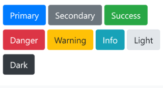
Alerts are used to display feedback messages based on the user’s actions. In this example code snippet, create HTML elements to display alert messages with any length of text. The style of alert boxes is defined with CSS and you can use these alerts for any type of notification message (primary, secondary, success, error, warning, info). All these alert boxes are mobile responsive and can be used in HTML webpage.
<div class="alert alert-primary">
    A simple primary alert—check it out!
</div>
<div class="alert alert-secondary">
    A simple secondary alert—check it out!
</div>
<div class="alert alert-success">
    A simple success alert—check it out!
</div>
<div class="alert alert-danger">
    A simple danger alert—check it out!
</div>
<div class="alert alert-warning">
    A simple warning alert—check it out!
</div>
<div class="alert alert-info">
    A simple info alert—check it out!
</div>
.alert {
    position: relative;
    padding: 0.75rem 1.25rem;
    margin-bottom: 1rem;
    border: 1px solid transparent;
    border-radius: 0.25rem;
}

.alert-primary {
    color: #004085;
    background-color: #cce5ff;
    border-color: #b8daff;
}
.alert-secondary {
    color: #383d41;
    background-color: #e2e3e5;
    border-color: #d6d8db;
}
.alert-success {
    color: #155724;
    background-color: #d4edda;
    border-color: #c3e6cb;
}
.alert-danger {
    color: #721c24;
    background-color: #f8d7da;
    border-color: #f5c6cb;
}
.alert-warning {
    color: #856404;
    background-color: #fff3cd;
    border-color: #ffeeba;
}
.alert-info {
    color: #0c5460;
    background-color: #d1ecf1;
    border-color: #bee5eb;
}
💰 Budget-friendly • 🌍 Global clients • 🚀 Production-ready solutions
