close
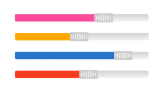
The progress bar is used to represent the progress of the task in a graphical view. Mostly, the uploading/downloading task uses a progress bar component to display the completion process in graphical bar format. When the user triggers an event, the progress bar is very useful to notify them about the time they need to wait for completing the process.
The process bar in HTML shows progress in percentage. In this example code snippet, we will build the responsive progress bar component with HTML and CSS. This custom progress bar component can be used in HTML to display the progress of the background task.
We have defined 4 different classes to change the progress bar color other than the default color. You can use these classes to change the process bar background color.
.bg-info.bg-warning.bg-success.bg-danger<div class="progress">
<div class="progress-bar" style="width: 75%;" aria-valuenow="75" aria-valuemin="0" aria-valuemax="100">75%</div>
</div>
<div class="progress">
<div class="progress-bar bg-info" style="width: 25%;" aria-valuenow="25" aria-valuemin="0" aria-valuemax="100">25%</div>
</div>
<div class="progress">
<div class="progress-bar bg-warning" style="width: 50%;" aria-valuenow="50" aria-valuemin="0" aria-valuemax="100">50%</div>
</div>
<div class="progress">
<div class="progress-bar bg-success" style="width: 75%;" aria-valuenow="75" aria-valuemin="0" aria-valuemax="100">75%</div>
</div>
<div class="progress">
<div class="progress-bar bg-danger" style="width: 95%;" aria-valuenow="95" aria-valuemin="0" aria-valuemax="100">95%</div>
</div>
.progress {
    display: -ms-flexbox;
    display: flex;
    height: 1.5rem;
    overflow: hidden;
    line-height: 0;
    font-size: .95rem;
    background-color: #e9ecef;
    border-radius: 0.25rem;
    margin-bottom: 1rem;
}
.progress-bar {
    display: -ms-flexbox;
    display: flex;
    -ms-flex-direction: column;
    flex-direction: column;
    -ms-flex-pack: center;
    justify-content: center;
    overflow: hidden;
    color: #fff;
    text-align: center;
    white-space: nowrap;
    background-color: #007bff;
    transition: width .6s ease;
}


.bg-info {
    background-color: #17a2b8!important;
}
.bg-warning {
    background-color: #ffc107!important;
}
.bg-success {
    background-color: #28a745!important;
}
.bg-danger {
    background-color: #dc3545!important;
}
💰 Budget-friendly • 🌍 Global clients • 🚀 Production-ready solutions
