close
The HTML table is the most used element in the web application. Basically, the HTML table is used to present the data in row and column format on the web page. It is most preferable to make tables responsive for a better user experience. If your web application uses Bootstrap, you can easily build a table design within a minute. Also, you can make the Bootstrap table responsive by adding a single class.
In this tutorial, we will show you how to create a responsive table with Bootstrap. Using Bootstrap you can improve the appearance of the HTML table in an easy way and make a responsive table for different devices. The Bootstrap responsive table is the perfect choice for data listing.
The following different types of table examples help you to create horizontal tables with basic styling using Bootstrap.
The Bootstrap and jQuery library need to be included to use Bootstrap framework.
<link rel="stylesheet" href="https://maxcdn.bootstrapcdn.com/bootstrap/3.3.7/css/bootstrap.min.css">
<script src="https://ajax.googleapis.com/ajax/libs/jquery/3.2.1/jquery.min.js"></script>
<script src="https://maxcdn.bootstrapcdn.com/bootstrap/3.3.7/js/bootstrap.min.js"></script>
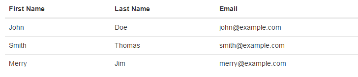
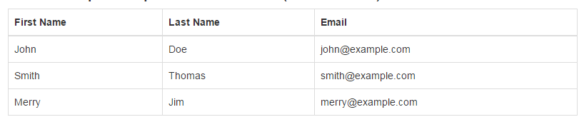
Use table class to add basic style to the HTML table. The table-responsive class makes table responsive.
<div class="table-responsive">
    <table class="table">
        <thead>
            <tr>
                <th>First Name</th>
                <th>Last Name</th>
                <th>Email</th>
            </tr>
        </thead>
        <tbody>
            <tr>
                <td>John</td>
                <td>Doe</td>
                <td>john@example.com</td>
            </tr>
            <tr>
                <td>Smith</td>
                <td>Thomas</td>
                <td>smith@example.com</td>
            </tr>
            <tr>
                <td>Merry</td>
                <td>Jim</td>
                <td>merry@example.com</td>
            </tr>
        </tbody>
    </table>
</div>
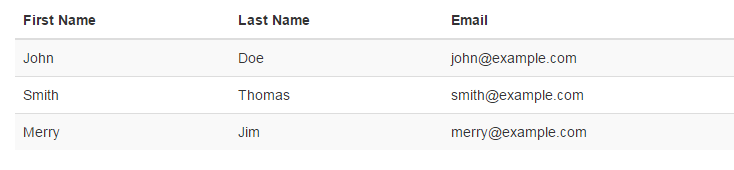
Use table-striped class to add stripes to the HTML table.
<div class="table-responsive">
    <table class="table table-striped">
        <thead>
            <tr>
                <th>First Name</th>
                <th>Last Name</th>
                <th>Email</th>
            </tr>
        </thead>
        <tbody>
            <tr>
                <td>John</td>
                <td>Doe</td>
                <td>john@example.com</td>
            </tr>
            <tr>
                <td>Smith</td>
                <td>Thomas</td>
                <td>smith@example.com</td>
            </tr>
            <tr>
                <td>Merry</td>
                <td>Jim</td>
                <td>merry@example.com</td>
            </tr>
        </tbody>
    </table>
</div>
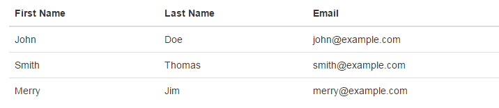
Use table-hover class to add a hover effect to the HTML table rows.
<div class="table-responsive">
    <table class="table table-hover">
        <thead>
            <tr>
                <th>First Name</th>
                <th>Last Name</th>
                <th>Email</th>
            </tr>
        </thead>
        <tbody>
            <tr>
                <td>John</td>
                <td>Doe</td>
                <td>john@example.com</td>
            </tr>
            <tr>
                <td>Smith</td>
                <td>Thomas</td>
                <td>smith@example.com</td>
            </tr>
            <tr>
                <td>Merry</td>
                <td>Jim</td>
                <td>merry@example.com</td>
            </tr>
        </tbody>
    </table>
</div>
Use table-bordered class to add borders to the HTML table.
<div class="table-responsive">
    <table class="table table-bordered">
        <thead>
            <tr>
                <th>First Name</th>
                <th>Last Name</th>
                <th>Email</th>
            </tr>
        </thead>
        <tbody>
            <tr>
                <td>John</td>
                <td>Doe</td>
                <td>john@example.com</td>
            </tr>
            <tr>
                <td>Smith</td>
                <td>Thomas</td>
                <td>smith@example.com</td>
            </tr>
            <tr>
                <td>Merry</td>
                <td>Jim</td>
                <td>merry@example.com</td>
            </tr>
        </tbody>
    </table>
</div>
Looking for expert assistance to implement or extend this script’s functionality? Submit a Service Request
💰 Budget-friendly • 🌍 Global clients • 🚀 Production-ready solutions
